7 Ways to Fix a Boring Blank Wall

Create a Curated Gallery Wall
Add Texture with Floating Shelves
Go Big with Oversized Art
Use Sconces for Ambient Lighting
Install a Statement Mirror
Try a Textured Wallpaper Accent
Hang a Large Textile or Tapestry
A client once sat in a perfectly curated mid-century modern living room, surrounded by a velvet sofa and a solid walnut coffee table, and sighed. The room was expensive, but it felt hollow. The culprit wasn't the furniture; it was the vast, white expanse of the wall behind the sofa—a void that sucked the energy right out of the room. A blank wall isn't just empty space; it's a missed opportunity to tell a story. This post looks at seven distinct ways to treat your walls as a canvas rather than an afterthought.
How Can I Decorate a Large Wall Without It Looking Cluttered?
The most effective way to decorate a large wall without clutter is to use a single, large-scale focal point rather than a collection of small, disconnected items. Think of it as a visual anchor. Instead of peppering the wall with tiny, insignificant trinkets, select one substantial piece—a large oil painting, a hand-woven textile, or a custom-built wooden installation—that commands the eye's attention.
Small items often create visual noise. If you have a lot of small pieces, they can end up looking like a collection of scraps rather than a deliberate design choice. This is why I often suggest looking toward the concept of scale in art. You want the piece to feel proportional to the room's volume. If the wall is twelve feet wide, a tiny 12x12 print will look lost. It won't just look small; it will look accidental.
If you aren't ready for one massive piece, try grouping items into a cohesive "zone." This creates a sense of order. A well-placed sideboard with a single, oversized mirror above it provides a sense of structural weight that a dozen small frames simply cannot achieve.
1. The Art of the Oversized Statement
Go big or go home. There is a specific kind of confidence required to hang a single, massive piece of art. It requires a certain level-headedness to trust that the piece can carry the weight of the room. A large-scale abstract or a high-quality photograph can act as the heartbeat of a room.
I've always been a fan of the "one and done" approach. It removes the decision fatigue of trying to balance multiple pieces. If you find a piece that speaks to you—perhaps a heavy-framed landscape or a minimalist geometric print—let it breathe. Don't feel the need to surround it with more "stuff" to make it look complete. The emptiness around the piece is what gives it its power.
2. Architectural Molding and Texture
Sometimes, the "decoration" shouldn't be something you hang, but something that is part of the wall itself. Wall molding—think wainscoting, picture frame molding, or even simple slat wood panels—adds depth through shadow and light. It turns a flat surface into a three-dimensional one.
This is a brilliant way to add character to a room without spending a fortune on art. Adding simple box molding can make a standard rental apartment feel like a historical townhouse. It’s a subtle way to introduce rhythm to a room. It’s also a great way to solve why a dining room feels awkward, as it provides a sense of permanence and structure that bare walls lack.
3. The Functional Gallery (Shelving)
Why choose between art and function? Floating shelves or a built-in library-style arrangement turn a blank wall into a living, breathing entity. This is where you can display your curated collection of ceramics, vintage books, or even small plants.
However, there is a fine line between a curated shelf and a junk drawer on a wall. To avoid the "messy" look, I recommend following a strict color palette or a specific material theme. If your shelves are a mix of brass, ceramic, and paper, ensure they all share a common thread. This prevents the wall from looking like a cluttered afterthought. If you struggle with this, you might want to revisit why your bookshelves look messy to refine your approach.
| Method | Visual Impact | Complexity Level | Best For |
|---|---|---|---|
| Single Large Art | High/Bold | Low | Minimalist spaces |
| Wall Molding | Subtle/Elegant | Medium | Traditional/Classic rooms |
| Floating Shelves | Dynamic/Textural | High | Small apartments/Living rooms |
| Textile Hangings | Warm/Soft | Low | Bedroom/Reading nooks |
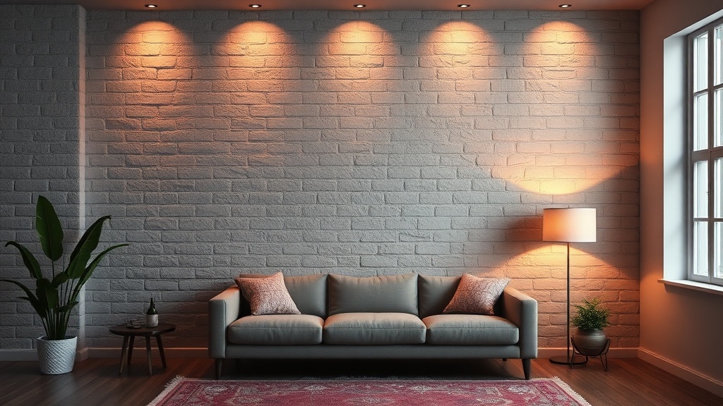
4. Layered Lighting and Shadow
Light is the most underrated tool in a designer's kit. A blank wall is just a surface, but a wall hit by a well-placed picture light or a sculptural sconce becomes a stage. A brass sconce from a brand like Kelly Wearler or even a more accessible modern option can change the entire mood of a room once the sun goes down.
The goal isn't just to see the wall, but to see the light playing across it. Using wall-mounted lights creates a sense of intimacy. It draws the eye upward and creates a sense of verticality. This is particularly effective in rooms with high ceilings where the top half of the room feels disconnected from the furniture.
5. The Curated Gallery Wall (The Right Way)
A gallery wall doesn't have to look like a chaotic collage from a dorm room. To do it right, you need a central theme or a consistent framing style. If you use mismatched frames, ensure they share a common color—perhaps all black, or all natural wood. This provides the "glue" that holds the disparate pieces together.
I suggest starting with your largest piece and building outwards. Don't just nail things to the wall as you find them. Lay them out on the floor first. This is where the precision of a curator comes into play. You are looking for balance, not just a collection. A well-composed gallery wall should feel like a single unit of design, not a series of accidents.
6. Large-Scale Textiles
There is something incredibly tactile and grounding about a textile hanging. A large tapestry, a vintage rug, or even a high-quality linen piece can soften the acoustics of a room. This is a great trick for rooms that feel "cold" or "echoey."
Textiles add a layer of softness that a hard-framed print simply cannot. It introduces organic shapes and textures that break up the rigid lines of a room. It’s a move that feels a bit more bohemian, but when executed with high-quality materials, it remains deeply sophisticated.
7. Sculptural Wall Objects
If you find traditional art a bit stale, look toward three-dimensional objects. A collection of ceramic plates, a sculptural metal piece, or even a series of woven baskets can turn a wall into a gallery of form. These objects cast shadows, which adds a layer of depth that a flat print lacks.
This approach is perfect for people who want a room that feels "collected" rather than "decorated." It feels more personal and less like a showroom. Just be careful—the moment you add too many different types of objects, you lose the sense of cohesion. Stick to one medium or one material to keep the look intentional.
At the end of the day, a wall is more than just a boundary between two rooms. It's a chance to express a point of view. Whether you choose the bold simplicity of a single canvas or the intricate texture of a wall of shelves, make sure the choice is a deliberate one. Don't just fill the space; command it.