Why Your Bookshelves Look Messy and Unbalanced

Quick Tip
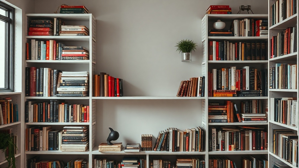
Mix vertical and horizontal book stacks to create visual variety and height.
The Hidden Friction in Your Library
Does your bookshelf look like a cluttered collection of objects rather than a curated part of your home? Most people treat shelving as mere storage, but a disorganized shelf creates visual noise that disrupts the flow of a room. When books are packed too tightly or objects are placed without regard for scale, the result is a sense of "visual weight" that feels heavy and unpolished.
The Error of Uniformity
One of the most common mistakes is arranging books strictly by height or, conversely, shoving them all vertically in a single line. While a uniform row of spines might look tidy, it lacks the architectural rhythm that makes a space feel lived-in. To fix this, you must introduce varied orientations. Try stacking some books horizontally to create "pedestals" for smaller objects, and stand others vertically to provide height. This creates a landscape of different levels rather than a flat, monotonous wall.
Balance Through Negative Space
A bookshelf that is 100% full is not a curated collection; it is a storage unit. To achieve a professional aesthetic, you must incorporate negative space. Leave gaps between groupings of books to allow the eye to rest. If you have a large, heavy set of encyclopedias or art books, do not cluster them all on one side, which creates a "tipping" sensation. Instead, distribute the weight. A heavy object on the bottom left should be balanced by a grouping of smaller objects or a vertical stack on the top right.
When selecting objects to break up the rows of books, consider these three rules for better composition:
- Vary the Material: If your books have mostly paper and cloth textures, introduce a ceramic vessel from Heath Ceramics or a brass object to add a different tactile quality.
- Respect the Rule of Three: Grouping objects in odd numbers—specifically three—is more visually stimulating than even pairings. You can read more about this in our guide on the rule of three.
- Mind the Scale: A tiny trinket lost in a large shelf looks like clutter. Ensure your decorative objects are proportional to the shelf height.
Color Coordination vs. Visual Chaos
If your collection feels chaotic, look at the spines. A riot of bright, clashing colors can make a room feel restless. You don't need to hide your books, but you can curate them. Try grouping books by spine color to create cohesive color blocks, or turn some books around so the pages face outward for a neutral, monochromatic look. This technique reduces visual friction and brings a sense of intentionality back to your interior design.