6 Ways to Style Your Bookshelves Like a Pro

Vary Book Orientation
Layer with Decorative Objects
Add Organic Elements
Use Negative Space
Create Triangles of Color
Incorporate Different Heights
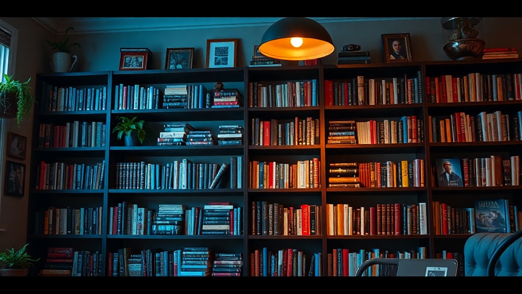
A single, heavy volume of Taschen’s The Archive rests on a shelf of solid walnut, its spine slightly weathered, positioned next to a hand-thrown ceramic vessel from a small studio in Kyoto. This isn't just storage; it is a visual narrative. Most people treat bookshelves as mere utility—a place to hide clutter or stack paperbacks—but a well-styled shelf serves as the architectural backbone of a room. This guide provides six practical, design-led strategies to transform your shelving from a disorganized stack into a curated collection that reflects both your intellect and your aesthetic rigor.
1. Vary the Orientation of Your Volumes
The most common mistake in bookshelf styling is the "uniform verticality" trap. When every book stands upright, the eye slides across the shelf without stopping, creating a monotonous line that lacks rhythm. To break this, you must manipulate the geometry of your collection.
Mix vertical stacks with horizontal ones. A horizontal stack of three or four large-format coffee table books acts as a functional pedestal. This creates a new "surface" within the shelf, allowing you to place a smaller object—perhaps a brass weight or a small piece of sea glass—on top. This technique adds height variation and depth. If you have a collection of slender, uniform hardbacks, try grouping them in small clusters of five, then breaking the pattern with a horizontal stack of two oversized art books. This creates a sense of intentionality rather than accidental accumulation.
2. Curate by Color and Spine Texture
Color is one of the most potent tools in a designer's kit, but it must be used with restraint to avoid looking like a retail display. There are two primary ways to approach this: the monochromatic method and the tonal gradient.
- The Monochromatic Approach: Group books by a single dominant color. If you have a collection of vintage cloth-bound books in various shades of forest green, group them together. This creates a "color block" effect that feels cohesive and calm.
- The Tonal Gradient: Arrange books in a spectrum. Move from light creams to deep ochres, or from pale blues to midnight navy. This mimics the natural transition found in the physical world and feels more organic than a stark, high-contrast arrangement.
Be aware of spine texture. A matte, linen-wrapped spine has a completely different visual weight than a high-gloss modern dust jacket. Mix these textures to prevent the shelves from looking "flat." A weathered, cloth-bound spine offers a tactile quality that complements modern, sleek paperbacks.
3. Integrate Non-Book Objects (The Rule of Three)
A shelf filled only with books is a library; a shelf filled with books and objects is a curated display. To avoid a cluttered look, use the "Rule of Three." The human eye finds groups of three objects more aesthetically pleasing and balanced than even numbers. These objects should not be random; they should be chosen for their form, material, and ability to tell a story.
Consider the following categories for your "shelf fillers":
- Organic Elements: A trailing Pothos plant in a terracotta pot adds movement and life. If you lack a green thumb, a single dried branch in a minimalist ceramic vase provides a sculptural, architectural quality. This is a great way to bring nature indoors through structured design.
- Sculptural Objects: Think of objects with distinct silhouettes. A heavy marble sphere, a brass magnifying glass, or a hand-carved wooden bowl. These provide a break from the rectangular geometry of the books.
- Personal Artifacts: A piece of pottery from a trip to Portugal or a vintage camera adds a layer of soul. These items should be treated as art, not just "stuff."
4. Manage Negative Space and Visual Weight
One of the most critical aspects of professional styling is knowing when to stop. Negative space—the empty areas on a shelf—is just as important as the objects themselves. A shelf that is packed from edge to edge feels heavy, claustrophobic, and visually exhausting. It creates "visual noise" that can overwhelm a room.
To achieve a professional look, leave intentional gaps. A wide gap between two clusters of books allows the eye to rest. If you have a deep, dark bookshelf, use more negative space to prevent the unit from looking like a "black hole" in your living room. If you are working within a smaller area, such as a study or a small apartment, you might want to use specific color schemes to ensure the shelving doesn't dominate the space, but the principle of negative space remains the same: breathing room is luxury.
5. Layer Depth with Layered Objects
Standard shelving often looks two-dimensional because everything is placed in a single line. To create a professional, high-end look, you must play with depth. This involves placing objects in front of, behind, or even partially overlapping your books.
Try placing a small, flat object—like a vintage postcard or a small framed sketch—leaning against the back of the shelf, partially obscured by a stack of books. Alternatively, place a medium-sized object (like a ceramic vase) in front of a vertical row of books. This layering technique creates a sense of three-dimensional space and makes the shelving unit feel like an integrated part of the room's architecture rather than a piece of furniture pushed against a wall.
6. Balance Scale and Proportion
The scale of your objects must be in conversation with the scale of your shelves. A tiny, delicate porcelain figurine will look lost and insignificant next to a massive, heavy encyclopedia. Conversely, a large, chunky wooden bowl will look clumsy if placed on a narrow, spindly shelf.
When styling, look at the "visual weight" of your items. A dark, heavy object has more visual weight than a light-colored, translucent one. If you have a shelf with heavy, dark books, balance them with a lighter, more airy object like a glass vessel or a thin metal sculpture. This prevents the shelving from feeling "bottom-heavy" or lopsided. Aim for a rhythmic balance where the eye travels from a heavy element to a light one, creating a sense of equilibrium across the entire unit.
"Design is not just about what you add, but what you have the courage to leave out. A bookshelf is a composition, not a storage bin."
Ultimately, your bookshelves should be a reflection of your personal curation. While these rules provide a structural framework, do not be afraid to break them. The most compelling spaces are those that feel lived-in and intentional, where the precision of a well-placed object meets the warmth of a personal history.