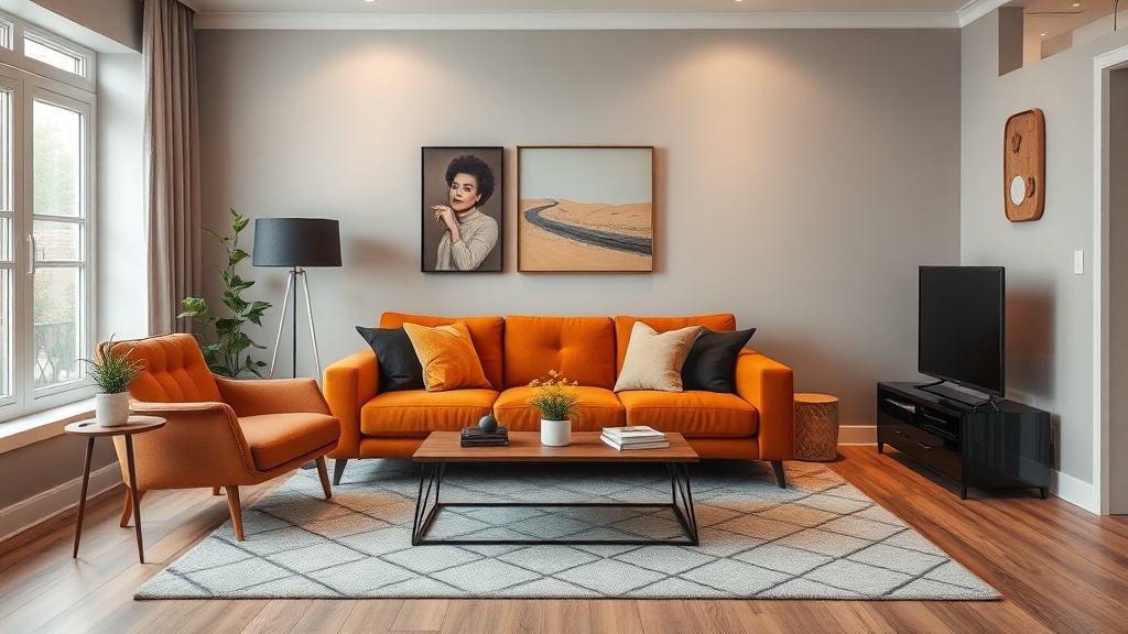
7 Best Color Schemes for Small Living Rooms

Classic Neutrals: Cream, Beige, and Warm White
Soft Blues and Whites for a Calming Coastal Vibe
Warm Earth Tones: Terracotta, Tan, and Olive
Sophisticated Monochromatic Grays
Air-Pastel Palette: Blush, Mint, and Pale Yellow
Bold and Dark: Navy Accent Wall with Light Furniture
Sage Green and Cream for Nature-Inspired Serenity
The Tyranny of White Walls
Walk into any estate agent's window display and you'll see the same prescription repeated ad infinitum: small space, paint it white. It's the design equivalent of suggesting Arial for a wedding invitation—technically functional, spiritually bankrupt. After fifteen years in London agencies and another eight running a design bookshop in Bloomsbury, I've learned that constraint breeds character, and nowhere is this truer than in the modest living room.
The small living room is not a problem to be solved. It is an opportunity for intimacy, for curation, for colour that wraps around you like a well-tailored coat. What follows are seven colour schemes that refuse the expansion-by-erasure approach. Each has been tested not by algorithm but by architects, textile designers, and the quiet rebels who understand that a room's power lies in its conviction, not its square footage.
"A small room painted with intention will always feel larger than a cavernous one painted with fear."
1. Farrow & Ball's De Nimes and School House White
There is a reason Patrick Baty, the architectural paint historian, keeps returning to this pairing. De Nimes is not quite blue, not quite grey—a colour that shifts with the light like the Breton sea it references. Against School House White, it creates a dialogue rather than a contrast.
The application is specific: paint the main walls in De Nimes at full strength, then use School House White for the ceiling, skirting boards, and any built-in shelving. The trick lies in the woodwork. By painting architraves and skirting in the lighter shade, you blur the boundaries between wall and ceiling, allowing the eye to travel upward without the abrupt punctuation of bright white.
Pair with linen upholstery in raw oatmeal, oak furniture with visible joinery, and brass lighting that has begun to tarnish. The overall effect is of a room that has always existed, that you have merely discovered.
2. Studio Green and Old White by Farrow & Ball
Before you recoil at the notion of dark green in a confined space, consider the Victorian smoking room, the panelled library, the London club. These were not large rooms, yet they commanded attention through depth rather than dimension.
Studio Green absorbs light in the most generous way possible—it makes a room feel embraced. Used on all four walls, including the woodwork, it creates what architects call a "continuous envelope." The ceiling, painted in Old White, becomes a luminous panel floating above.
The practical execution requires confidence. Paint radiators and pipes the same green. Let curtains match the walls exactly—this is not the place for contrast. Furnish with leather in cognac or tobacco tones, wood that has darkened with age, and artwork in gilt frames. The room will feel smaller, yes, but in the manner of a first-class railway carriage: contained, luxurious, complete.
3. Little Greene's French Grey and Slaked Lime
The Little Greene archive contains pigments that other manufacturers abandoned decades ago. Their French Grey is one such resurrection—a colour that exists in the space between stone and shadow, warm without being yellow, cool without being cold.
Used in a north-facing room, it responds to limited natural light with remarkable consistency. Unlike paler neutrals that can turn chalky or yellow in low light, French Grey maintains its composure. Pair it with Slaked Lime on woodwork for a tonal scheme that relies on texture rather than contrast for interest.
The specific application: walls in French Grey Dark, ceiling in French Grey Mid, woodwork in Slaked Lime. This creates three distinct planes that read as harmonious rather than divided. Add woven textures—jute, rush, unbleached wool—and furniture with visible grain. The result is a room that feels considered, restful, entirely without anxiety.
4. Hague Blue and Strong White
Perhaps no colour has been more misunderstood in the age of Instagram than navy blue. Used incorrectly, it becomes nautical pastiche. Used with precision, as in the pairing of Farrow & Ball's Hague Blue with Strong White, it becomes something else entirely: atmospheric, continental, quietly expensive.
The key is commitment. Hague Blue demands to be used on walls, ceiling, and woodwork in equal measure. This unifies the architecture and eliminates the visual clutter of contrasting trim. The Strong White appears only in specific moments: the inside of a cupboard door, the back of a bookshelf, the frame of a mirror.
This scheme excels in rooms with original features—fireplace surrounds, cornicing, picture rails. The deep blue throws these details into relief without the harshness of black. Furnish with terracotta, rust, and burnt sienna. Add linen in unbleached ecru. The room will feel like a Rothko painting: contained depth, infinite suggestion.
5. Setting Plaster and Pink Ground
There is a particular shade of pink that appears in the plasterwork of Georgian houses, in the faded grandeur of Venetian palazzos, in the notebooks of Luis Barragán. It is not feminine in the commercial sense; it is the colour of earth, of flesh, of architectural history itself.
Farrow & Ball's Setting Plaster captures this perfectly. Used on walls with Pink Ground on woodwork and ceiling, it creates a room that glows—literally. The pigment reflects warm light back into the space, making it feel simultaneously cosy and expansive.
The execution requires restraint. Do not introduce bright white anywhere; it will kill the effect. Use natural materials exclusively: unvarnished walnut, hand-thrown ceramics, wool in oatmeal and charcoal. Brass should be unlacquered, allowed to darken. The overall impression is of a room that has been lived in for centuries, that has witnessed conversations worth having.
6. Treron and Lime White
Green is the most difficult colour to get right in interior design. Too yellow and it becomes institutional; too blue and it turns cold; too saturated and it dominates completely. Farrow & Ball's Treron occupies the narrow band where green becomes neutral—a soft, dusty sage that references French country houses and the painted shutters of Amsterdams grachtenhuizen.
Paired with Lime White, it creates a scheme that feels both fresh and established. The application strategy differs from the all-enveloping approach of Hague Blue or Studio Green. Here, you paint the walls in Treron, the ceiling in Lime White, and the woodwork in a 50/50 mix of the two. This creates subtle gradation rather than sharp contrast.
This scheme tolerates pattern better than most. Consider a vintage Persian rug with worn vegetable dyes, botanical prints in simple frames, ticking stripes in charcoal on natural linen. The room will feel like a garden room in winter: quiet, expectant, alive beneath the surface.
7. Down Pipe and All White
For those who genuinely cannot abandon the comfort of grey, there is a way to execute it with conviction. Farrow & Ball's Down Pipe is not the cold, corporate grey of open-plan offices. It contains warmth, depth, a suggestion of lead and slate and London rain.
The pairing with All White is calculated. Use Down Pipe on three walls, All White on the fourth—typically the wall with the primary window. This creates a light reflector that bounces natural light deep into the room while the surrounding grey absorbs and quietens. Paint all woodwork in All White to maintain this luminosity.
Furnish with blackened steel, concrete with visible aggregate, leather in espresso and chocolate tones. Add artwork with strong graphic elements—woodcuts, architectural drawings, monochrome photography. The room will feel like a gallery in a converted warehouse: intentional, edited, distinctly urban.
The Matter of Finish
No discussion of colour is complete without addressing sheen. In small rooms, the wrong finish can undo the most carefully selected palette. The rules are specific: ceilings should be Estate Emulsion (flat, light-absorbing), walls should be Modern Emulsion (wipeable, consistent), woodwork should be Estate Eggshell (subtle lustre that catches light).
Never use full gloss in a small room unless you are creating a deliberate jewel-box effect. Never use vinyl silk unless you are running a dental practice. The finish should invite touch, not repel it.
Conclusion: Permission to Commit
The small living room is where most of us actually live. It deserves more than the default settings of rental agreements and renovation shows. Each of the schemes above requires something that cannot be purchased: the willingness to make a decision and stand by it.
Colour is not fashion. It is not updated seasonally like a wardrobe. The right colour scheme for your small living room is the one you can live with for ten years, that will look better as it fades and wears and accumulates the patina of use. Choose with precision. Apply with care. Live with conviction.