Why Your Kitchen Countertop Always Looks Messed Up

The assumption that a messy kitchen countertop is a result of poor cleaning habits is fundamentally flawed. Most people believe that a quick wipe-down with a microfiber cloth and a spray of citrus cleaner will solve the visual chaos, but clutter is rarely a matter of hygiene; it is a matter of composition and scale. A kitchen countertop looks "messed up" because it is suffering from a lack of intentional grouping, a mismatch in object height, and a failure to respect the negative space that allows a surface to breathe. This guide addresses the structural reasons your surfaces feel chaotic and provides a framework for organizing them with a curator's eye.
The Problem of Visual Noise
Visual noise occurs when the eye cannot find a place to rest. In a kitchen, this is often caused by a collection of disparate, small objects that lack a unifying theme or a shared geometric logic. When you have a salt cellar next to a toaster, which sits beside a stray mail pile and a bottle of dish soap, the eye jumps frantically from one item to the next. This lack of cohesion creates a sense of anxiety rather than a sense of a functional workspace.
To combat this, you must move away from the idea of "putting things away" and move toward the idea of "staging objects." Even the most utilitarian items—like a wooden cutting board or a marble mortar and pestle—can serve as structural elements if they are treated as part of a deliberate composition. The goal is to transition from a collection of random tools to a curated vignette.
Eliminate the "Micro-Clutter"
The most common culprit of a messy countertop is the accumulation of small, non-decorative items that serve no immediate purpose in a high-traffic moment. This includes loose tea bags, half-used recipe cards, or stray grocery lists. These items lack the weight to stand as design elements, so they simply appear as debris.
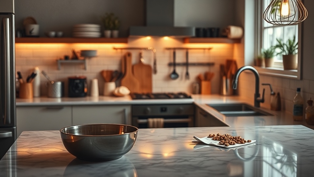
- Use a dedicated tray: Instead of letting your olive oil, salt shaker, and pepper mill sit loosely on the stone, place them on a small, high-quality tray. A tray—whether it is a heavy brass dish, a honed marble slab, or a simple wooden board—creates a visual boundary. It tells the eye, "These items belong together," effectively turning a mess into a single, cohesive unit.
- The Rule of Three: When grouping items, avoid even numbers. An even number of objects creates a sense of symmetry that can feel static or clinical, whereas an odd number of objects—specifically three—creates a natural, organic rhythm. A tall bottle of balsamic vinegar, a medium-sized olive oil cruet, and a small ceramic salt cellar create a pleasing triangular composition.
- Contain the small stuff: If you have small items like spices or citrus fruits, move them into uniform containers. A glass apothecary jar for sugar or a heavy ceramic bowl for lemons provides a sense of permanence and intention that a plastic bag or a mismatched container cannot.
The Importance of Scale and Height
A common mistake in kitchen styling is maintaining a uniform height across the entire countertop. If every item—the toaster, the knife block, the coffee maker, and the spice jars—is roughly the same height, the countertop looks flat and uninspired. This lack of verticality makes the space feel cluttered because there is no visual hierarchy.
To create a professional-looking surface, you must introduce varied elevations. This creates "layers" that guide the eye upward and downward, making the space feel more three-dimensional and architecturally sound.
Introducing Vertical Interest
Think of your countertop as a landscape. You need mountains, hills, and valleys. A "mountain" might be a tall, sculptural vase with a single branch of eucalyptus, or a high-end stand mixer like a KitchenAid Artisan. A "hill" might be a wooden bread box or a stack of heavy linen tea towels. The "valleys" are the flat surfaces, such as your marble or quartz workspace.
- The Anchor Piece: Every section of your counter needs one large, heavy item to act as an anchor. This could be a large wooden chopping block or a high-end espresso machine. This piece provides a visual weight that grounds the surrounding smaller items.
- The Vertical Accent: Use height to break up the horizontal plane. A tall, slender bottle of premium olive oil or a ceramic pitcher can provide the necessary verticality. However, be careful not to overdo it; too many tall objects can make the kitchen feel cramped and block your sightlines.
- Layered Textures: Height is not just about verticality; it is also about depth. Layering a small marble coaster beneath a heavy glass carafe adds a sense of intentionality and craftsmanship. This is similar to how one might style a coffee table to create a sense of depth and interest.
The Color Palette and Materiality
A kitchen often feels messy because of a "color clash" between functional items and the countertop material itself. If you have a white quartz countertop and you place a bright blue plastic dish soap bottle, a red toaster, and a neon green dish towel on it, the countertop will always look chaotic. The high contrast between the neutral stone and the bright, cheap materials creates visual friction.
To achieve a curated look, you must choose a color palette for your countertop items that complements your permanent surfaces. This is not about making everything the same color, but about ensuring the colors exist within a shared tonal family.
Curating Your Materials
Instead of buying whatever is on sale, select materials that possess a sense of weight and history. Plastic and cheap melamine should be replaced with organic, durable materials. This creates a sense of "timeless craft" that elevates the entire room.
- Wood: Use walnut or teak for cutting boards and utensil holders. The warmth of wood softens the hardness of stone or tile.
- Stone and Ceramic: If you have a granite countertop, avoid more granite accessories. Instead, opt for matte ceramic bowls or a honed marble tray. The contrast in texture—smooth stone against tactile ceramic—adds sophistication.
- Metal: Incorporate metals like aged brass, brushed nickel, or matte black steel. A heavy brass utensil crock provides a sense of permanence that a plastic container never will.
When you select these materials, you are essentially designing a "still life" that happens to be functional. This is a crucial distinction. A tool is just a tool, but a tool made of heavy cast iron or hand-thrown stoneware is a design object.
Managing the "Zone" Logic
A disorganized kitchen often stems from a lack of zoning. When items are placed based on convenience rather than location, the kitchen loses its logical flow. A well-designed kitchen should be divided into functional zones: the coffee station, the prep area, the cooking zone, and the cleaning zone. Each zone should have its own dedicated "vignette" that follows the rules of scale, height, and materiality mentioned above.
The Coffee Station Example
If your coffee station is just a machine sitting next to a pile of sugar packets, it will look messy. To fix this, create a dedicated coffee zone. Use a small tray to hold your espresso machine, a ceramic mug, and a small jar of coffee beans. Add a single, small wooden spoon and perhaps a small, textured ceramic bowl for your stirrers. By grouping these items, you have turned a "messy corner" into a "destination."
The Prep Zone
The prep zone should be dominated by tactile, natural materials. A large, heavy wooden cutting board serves as the centerpiece. Beside it, place a small, heavy marble mortar and pestle. This creates a sense of "preparedness" and high-quality craft. If you have a knife block, ensure it is a substantial, sculptural piece rather than a flimsy plastic one. This ensures that even your most utilitarian tools contribute to the aesthetic integrity of the room.
By treating your kitchen countertop with the same rigor a curator applies to a gallery or a designer applies to a cozy reading nook, you move from the realm of "cleaning up" to the realm of "designing." The clutter disappears not because you have hidden it, but because you have given it a proper place within a larger, more intentional composition.