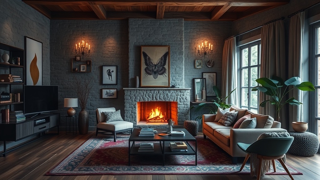
Curating a Sensory Sanctuary: Layering Textures for a Cozy Living Room

Most people believe that a "cozy" room is achieved through a high volume of objects or a specific color palette. They buy a plush velvet sofa, throw a chunky knit blanket over the arm, and wonder why the space still feels sterile or, worse, visually cluttered. The error lies in a fundamental misunderstanding of comfort. True coziness—what the Danes call hygge, but what I prefer to call sensory depth—is not about the quantity of items, but the strategic layering of tactile contrasts. A room that feels "flat" lacks the tension between smooth and rough, hard and soft, or matte and reflective surfaces. To curate a sensory sanctuary, one must design for the hands and the skin as much as the eyes.
The Foundation: Establishing a Tactile Base
The mistake most decorators make is selecting a single texture for their large-scale furniture. If your sofa, your rug, and your curtains are all made of a similar soft, brushed fabric, the room loses its structural interest. You must establish a "hard" foundation to anchor the "soft" layers. Start with the largest surface area: the floor. Instead of a standard synthetic pile rug, consider a Jute or Sisal rug from a high-quality weaver. The coarse, organic grain of jute provides a necessary friction that prevents a room from feeling overly slippery or precious.
Once the foundation is set, introduce the primary seating. If you have opted for a rough-hewn jute rug, your sofa should offer a counterpoint. A linen-wrapped sofa or a piece in a heavyweight bouclé provides a sophisticated middle ground. Linen offers a crisp, breathable texture that feels lived-in rather than stiff, while bouclé provides a rhythmic, nubby surface that catches the light in subtle, uneven ways. This creates a "visual weight" that makes the furniture feel permanent and grounded.
The Rule of Three: Hard, Soft, and Raw
To avoid the "showroom effect," every functional grouping in your living room should follow a triad of textures. A coffee table is the perfect place to practice this. If you have a solid walnut coffee table (a hard, smooth surface), do not simply place a book on it. Layer it with a ceramic tray (a matte, slightly porous surface) and a small linen napkin or a stack of heavy-weight paper journals (a soft, organic surface).
- Hard: Marble, walnut, blackened steel, or tempered glass.
- Soft: Velvet, brushed cotton, silk, or heavy linen.
- Raw: Unfinished wood, terracotta, hand-thrown ceramics, or woven rattan.
By ensuring that no two adjacent surfaces share the same tactile profile, you create a sense of curated intention. A marble side table next to a velvet armchair is a classic pairing because the cold, unyielding nature of the stone highlights the warmth and yielding nature of the fabric.
Layering Textiles: The Art of the "Unfinished" Look
The most common failure in living room styling is the "perfectly placed" cushion. A row of identical, plumped pillows looks manufactured and uninviting. To achieve a sensory sanctuary, you must embrace the unperfected. This means mixing weights and weaves. A heavy waffle-weave cotton pillow should sit next to a sleek, high-sheen silk cushion. The contrast between the matte, structural weave of the cotton and the light-reflecting surface of the silk creates a sophisticated visual vibration.
When it comes to throws, avoid the temptation to buy a set. Instead, curate a collection of disparate materials. A merino wool throw offers a refined, smooth warmth, whereas a mohair blanket provides a fuzzy, ethereal texture. If you are looking to introduce a sense of history, a vintage hand-loomed tapestry or a heavy linen throw adds a sense of gravity that a modern polyester blend simply cannot replicate. This approach also allows you to incorporate timeless biophilic design elements, as natural fibers like wool and linen inherently connect the interior to the natural world.
Managing Light and Shadow through Texture
Texture is not just something you feel; it is something you see through the way it interacts with light. A flat, matte wall absorbs light, while a textured wall reflects it unevenly, creating depth. If you are working with standard drywall, you can introduce this depth through limewash paint. Unlike standard latex paint, limewash has a mineral-based, chalky finish that creates a soft, mottled patina. This adds a "living" quality to the walls, making the room feel as though it has aged gracefully rather than being freshly painted.
Lighting should be used to highlight these textures. Avoid the harsh, overhead glare of a single bright ceiling fixture. Instead, use layered task and ambient lighting. A pleated silk lamp shade will diffuse light softly, creating a glow, while a brushed brass floor lamp will create sharp, specular highlights. Position your lights to graze across textured surfaces—such as a stone fireplace or a linen curtain—to cast subtle shadows that emphasize the grain and weave of the material.
Curating the Small Details: The Final 5%
The difference between a house and a curated home lies in the final 5% of styling. This is where the "sensory" part of the sanctuary is truly built. This involves the objects that demand a touch. A hand-thrown stoneware vase with a visible thumbprint from the maker carries more soul than a mass-produced glass vessel. The slight irregularity of the clay provides a tactile satisfaction that a smooth, factory-made object lacks.
- The Scent Element: Texture isn't just visual. A heavy, scented soy candle in a dark glass jar adds a tactile weight to a mantle and a sensory layer to the air.
- The Paper Element: A stack of hardcover art books with linen-bound spines provides a structural, architectural element to a bookshelf.
- The Metallic Element: Introduce small hits of metal—a patinated bronze bowl or a brushed copper tray—to provide a sharp, cold contrast to the warmth of your textiles.
When selecting these objects, prioritize the "weight" of the item. A lightweight, flimsy plastic tray feels cheap and breaks the illusion of a sanctuary. A heavy, solid brass tray feels significant; it has a presence. This weight translates to a feeling of permanence and quality in the room.
Avoiding the Pitfalls of Over-Styling
The greatest danger in layering is descending into chaos. There is a fine line between a "layered" room and a "cluttered" room. To avoid this, maintain a strict color story. While your textures should be wildly varied, your color palette should remain cohesive. If you are working with a palette of ochre, charcoal, and cream, ensure that every new texture you add stays within those bounds. A textured cream linen pillow will look intentional; a textured bright blue polyester pillow will look like an accident.
Furthermore, leave "negative space." A sensory sanctuary needs room to breathe. If every surface is covered in a texture, the eye has nowhere to rest, and the brain becomes overstimulated. Leave one surface—perhaps a section of your coffee table or a corner of your sideboard—completely clear. This void acts as a visual palate cleanser, making the textures you have chosen stand out more prominently.
Design is not a game of addition; it is a game of curation. By focusing on the tension between materials—the rough against the smooth, the heavy against the light—you create a space that does more than just look good. You create a space that feels substantial, intentional, and profoundly restorative.
Steps
- 1
Identify Your Base Material
- 2
Introduce Varied Textures
- 3
Add Dimensional Accessories