Which Paint Finish Should You Use Where? The Room-by-Room Truth Most Guides Gloss Over

This guide breaks down exactly which paint finishes work best in every room of your home—and why getting it wrong costs you more than just aesthetics. You'll learn the practical differences between sheen levels, how light interacts with each surface, and the specific mistakes that make walls look amateur despite premium paint prices.
What's the Real Difference Between Eggshell and Satin Anyway?
Paint finish isn't just about shine—it's about durability, forgiveness, and how a room feels when you walk in. The finish you choose determines whether your walls whisper or shout, whether they hide the bumps of an old plaster job or spotlight every imperfection like a gallery inspection.
Flat or matte finishes absorb light, creating that coveted velvety depth you see in design magazines. But here's the catch: they mark if you so much as brush against them with a damp cloth. That beautiful, light-absorbing quality becomes a liability in high-traffic areas where hands actually touch walls—hallways, children's rooms, the wall behind your kitchen bin.
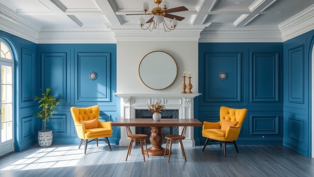
Eggshell sits one step up the sheen ladder, offering a subtle glow that reads as nearly flat from most angles but adds just enough resin to withstand occasional wiping. It's the workhorse finish for living rooms and dining spaces—sophisticated without being fussy, practical without looking institutional. The name comes from the resemblance to an actual eggshell: not shiny, not dull, just softly luminous.
Satin introduces noticeable reflectivity. Walls painted in satin catch window light and lamp glow, creating subtle movement across the surface throughout the day. This sounds romantic until you realize it also catches every roller mark, every patched crack, every place where the previous owner hung art with inadequate spackling. Satin demands better wall preparation than most homes actually have.
Semi-gloss and high-gloss are the extroverts of the paint world—reflective, dramatic, and unforgiving. They turn walls into mirrors (sometimes literally) and transform trim from functional afterthought into architectural statement. But apply high-gloss to a ceiling and you've created a disco ball; use it on walls with texture and you've highlighted every popcorn kernel and orange-peel bump.
Why Does My Living Room Feel Cold Even With Warm Colors?
The finish you've chosen might be sabotaging your color temperature. Flat finishes in north-facing rooms absorb the limited natural light, making even butter-yellow walls read as mustard mud. That same color in eggshell or satin catches and redistributes what light exists, warming the space without changing the paint can.
Living rooms present the classic paint dilemma: you want elegance, but you also live here. Coffee gets spilled. Dogs shake off rain. Children run past with sticky fingers barely missing the doorframe. This is where eggshell earns its keep—offering wipeability without the plastic sheen that makes a grown-up space feel like a rental unit.
For ceilings in living spaces, flat is almost always the right call. Ceilings receive no direct contact (usually), and any sheen draws attention upward—which isn't what you want unless you've invested in ornate plasterwork or coffered detail worth highlighting. A flat ceiling recedes visually, letting the room feel taller and keeping focus on the walls and furnishings where it belongs.
Trim presents the opposite logic. Baseboards, crown molding, door casings, and window frames need the durability that sheen provides—these surfaces take constant abuse from vacuums, shoes, furniture shuffling, and general life. Semi-gloss has been the standard for decades, but consider satin for a more contemporary look that doesn't scream "suburban spec house." The slightly lower sheen feels more considered, more European, less like you've followed a 1990s builder's checklist.
Which Finish Survives Kitchen Grease and Bathroom Steam?
Kitchens and bathrooms aren't just rooms—they're environments. Steam, grease splatter, toothpaste spray, and cleaning chemicals all wage war on painted surfaces. This is where many homeowners default to semi-gloss everywhere, creating spaces that feel like hospital corridors rather than homes.
The better approach: satin on walls, semi-gloss on trim and cabinets. Satin offers enough resin content to wipe down grease spatters without that glossy, clinical look. It handles humidity better than eggshell, resisting the moisture absorption that leads to mildew in bathroom corners. Your walls stay cleaner longer, and when they don't, you can actually clean them without destroying the finish.
Cabinets demand special consideration. They're touched constantly—opened with messy hands, leaned against while cooking, wiped down with varying degrees of chemical enthusiasm. Here, semi-gloss or even high-gloss (if you're feeling dramatic) provides the armor these hardworking surfaces need. Just ensure your prep is meticulous; gloss highlights every brush stroke and sanding shortcut.
For bathroom ceilings specifically, look for paints labeled "bathroom" or "kitchen and bath"—these contain mildewcides and are formulated to handle condensation cycles better than standard paints. Flat "ceiling paint" in a steam-filled bathroom is a recipe for black spots and early repainting. The slight upcharge for bathroom-specific formulas pays for itself in longevity.
Don't forget the spaces adjacent to these wet zones. Laundry rooms, utility closets, and mudrooms face similar moisture and wear challenges but often get painted with leftover living room eggshell because "it's just the laundry room." Treat these functional spaces with the same finish logic as kitchens and bathrooms—they work hard, and your paint should too.
How Do Professionals Make Cheap Paint Look Expensive?
It's rarely the paint—it's the preparation and application. Glossy finishes don't forgive. Before applying satin or semi-gloss, professionals spend hours patching, sanding, priming, and sanding again. The paint itself is almost an afterthought; the surface beneath determines the result.
For DIYers, this means honest assessment of your walls. Old houses with plaster that's seen ninety years of settlement cracks and previous owner's nail holes? Stick with eggshell or flat. New construction with fresh drywall and professional finishing? You can venture into satin territory. Trying to force high-gloss onto imperfect walls is like wearing a silk shirt over a lumpy sweater—the underlayer shows through no matter how beautiful the top material.
The direction you roll matters too. Professional painters work in consistent "W" patterns, maintaining wet edges to avoid lap marks. They back-roll sprayed finishes to even out coverage. They apply two coats minimum—three in deep colors—because thin paint looks cheap regardless of the can's price tag. These aren't trade secrets; they're simply the labor that creates results worth photographing.
Color also interacts with sheen in unexpected ways. Dark colors in flat finishes can look chalky or velvety depending on the light; the same color in satin reads as richer, more saturated, almost liquid. Light colors in high-gloss can feel clinical or incredibly fresh depending on what surrounds them. Always test your finish choice with your actual color in your actual space—not on a white poster board, but on the wall itself, observed morning, noon, and evening.
What About Ceilings, Trim, and Those Weird Architectural Details?
Ceilings in most rooms should disappear. Flat white (or a tint of your wall color 25% lighter) in flat finish keeps the fifth wall from competing with everything below. The exception? Coffered ceilings, tray ceilings, or any architectural detail you want to emphasize—here, satin or semi-gloss in a contrasting color turns structure into feature.
Trim deserves more thought than it usually gets. Matching trim to walls in a single color with varying sheens creates sophisticated, enveloping spaces—think walls in eggshell and trim in satin of the same tone. The contrast is subtle, detectable only as light moves across the room, but the effect is deeply calming. Conversely, crisp white semi-gloss trim against deep, flat walls creates definition and drama that reads as traditional or contemporary depending on the architecture.
Built-ins, wainscoting, and paneling present opportunities for intentional contrast. These elements can handle—and often deserve—more sheen than surrounding walls. A library painted in deep green flat above the chair rail and satin below creates visual weight and practical durability where hands rest. Window seats in semi-gloss survive the scuffs of daily use while drawing attention to a charming architectural feature.
Don't ignore the transitions. Where different sheens meet—wall to trim, ceiling to crown—cut in carefully. The line between eggshell and semi-gloss is visible even in the same color, and sloppy edges read as amateur immediately. Use quality brushes, work slowly, and accept that painting is 80% preparation and 20% actual application.
When in doubt, start flatter than you think you need. You can always add sheen later with a coat of higher-gloss paint; removing shine requires sanding or starting over. The current trend toward matte everything—matte walls, matte trim, even matte ceilings—reflects a desire for sophistication over practicality, for the look of aged European plaster over shiny American newness. It's not wrong, but it requires accepting that your walls will show life more readily. Some call this patina; others call it damage. Your tolerance determines your finish.
"The best painted room is one where you don't notice the paint at all—where color and finish work so harmoniously with light and architecture that the space simply feels right."
Choose based on how you actually live, not how you wish you lived. The magazine spread with velvet sofas and perfectly placed objets might inspire, but your home needs to survive breakfast and homework and rainy Saturdays. The right finish bridges that gap—beautiful enough to love, practical enough to keep.
For more on selecting the perfect color to pair with your chosen finish, explore Benjamin Moore's color tools. If you're tackling cabinets specifically, Fine Homebuilding's painting guides offer professional-grade preparation advice. And for understanding how light affects your choices, Architectural Digest's paint selection guide breaks down the science of undertones and illumination.