Visual Economy in 1950s Swiss Transit Tickets

Note the way a 1950s Swiss transit ticket refuses to perform for you. It does not flatter, it does not charm, it does not ask for attention. It simply delivers instructions at speed.
That is visual economy.
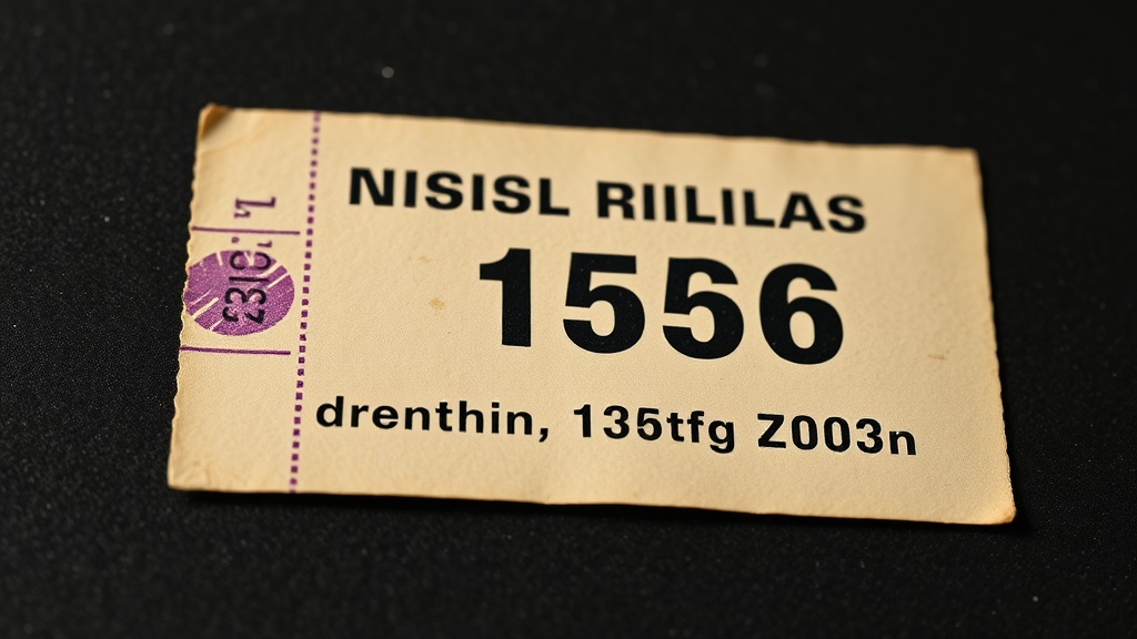
When I study surviving municipal tickets from Zurich and Basel, what strikes me is not nostalgia. It is discipline. The canvas is brutally small (often in the historical Edmondson format, roughly 57 x 30 mm), the print budget is unforgiving, and the paper is practical, not precious (typically uncoated board stock intended for handling, stamping, and pockets). Under those constraints, decorative ego dies quickly. What remains is hierarchy.
Why Did Constraints Make Swiss Transit Tickets So Effective?
Constraints made Swiss transit tickets effective because they forced an unambiguous reading order on a tiny, low-cost format.
In Zürich, the operator that became VBZ in 1950 inherited a ticketing culture from the Städtische Strassenbahn era built on operational clarity, not branding theater (Stadtarchiv Zürich, annual reports transition 1949-1950). In Basel, BVB's systems evolved with similar municipal pragmatism (BVB institutional profile). These were not "design projects" in the contemporary portfolio sense. They were public infrastructure.
On a ticket this small, you cannot hide weak decisions.
- Fare class must read first.
- Zone or route logic must read second.
- Date validation and control marks must be unmistakable.
- Everything else is noise.
Single-color printing and mechanical numbering forced compositional honesty. No gradient could rescue a poor layout. No oversized logo could compensate for confused reading order. You either built a hierarchy that worked in half a second, or you failed in public.
What Makes These Tickets an Example of "Ugly-Useful" Design?
"Ugly-useful" design means visual choices are judged by operational performance, not stylistic charm.
This is where many modern interfaces become timid. They imitate minimalism as an atmosphere: generous whitespace, muted palettes, soft corners, nothing offensive. But these tickets practice minimalism as consequence. They remove everything that does not serve a transaction.
There is a moral clarity in that posture. A transit ticket is not a stage for authorship; it is a contract between city and passenger.
You can feel it in the material logic: coarse board, hard edges, stamp pressure, occasional misregistration, visible wear. The object admits reality. It accepts that hands are wet, stations are loud, and attention is fractured.
Digital teams still design as if every user arrives calm, centered, and willing to explore. A conductor with thirty passengers boarding in rain is a better usability test than most prototype labs.
How Did Swiss Typography Create Rhythm on a 57 x 30 mm Ticket?
Swiss typography created rhythm by using strict grid relationships, dense but controlled spacing, and measurable alignment to speed scanning.

Note the way tightly set grotesk sans-serifs create rhythm through compression, not ornament. The letterforms do not relax into luxury spacing. They hold tension. Headline numerals carry authority. Secondary details sit in denser lines, but remain legible because alignment is strict and intervals are consistent.
Grid thinking is not about making things look clean. It is about making relationships measurable. Müller-Brockmann formalized this position in Grid Systems in Graphic Design (Niggli edition details); municipal print matter had already been proving it in practice.
On these tickets, every millimeter is negotiated.
- Margins are functional tolerances, not aesthetic cushions.
- Tracking is tuned for density without collapse.
- Alignment lines create scanning lanes for tired eyes.
- Type weight carries hierarchy where color cannot.
That is why the surface appears quiet but feels alive. The visual tension vibrates because each element is pulling exactly its assigned load.
What Can Digital Product Teams Learn from 1950s Swiss Design?
Digital product teams should borrow Swiss ticket logic by designing for reading order first, then proving every remaining element earns its place.
The same lesson appears across other artifacts in this archive: the invisible standard behind Helvetica-led systems, the typographic discipline of vintage matchbooks, and Rams's moral case for restraint at Braun.
Borrow these principles directly:
- Start from reading order, not mood boards.
- Treat every label as a cost center for attention.
- Use fewer type styles, but tune spacing aggressively.
- Let hierarchy come from structure before color.
- Test screens under stress conditions, not studio calm.
A Swiss transit ticket from seventy years ago had no onboarding flow, no tooltip choreography, no personalization layer. It still solved a complex public task quickly, repeatedly, and at scale.
That is not retro charm. That is performance.
FAQ: Swiss Transit Ticket Design
What is visual economy in graphic design?
Visual economy is the disciplined reduction of form so only information that improves comprehension remains.
Who was Josef Müller-Brockmann?
Josef Müller-Brockmann was a Swiss graphic designer and educator known for codifying grid-based communication in mid-century modern design systems.
What is the Edmondson ticket format?
The Edmondson format is a standardized small card ticket system, historically around 57 x 30 mm, designed for mechanical numbering and rapid handling (reference overview).
Why do old transit tickets matter for modern UI design?
Old transit tickets matter because they demonstrate information hierarchy under real constraints, which is precisely what high-stakes digital interfaces still require.
The takeaway: true minimalism is the art of difficult refusal. Mid-century Swiss transit tickets remind us that visual economy is not about looking sparse; it is about making form answer to function with zero vanity. In an era of polished interface spectacle, this small piece of municipal ephemera remains the sharper teacher.
Sources Consulted
- Stadtarchiv Zürich holdings list showing transition from "Geschäftsbericht Strassenbahn 1949" to "Geschäftsbericht Verkehrsbetriebe 1950": https://amsquery.stadt-zuerich.ch/Dateien/6/D32739.pdf
- Basel public transport institutional context (BVB profile/history pages): https://www.bvb.ch/en/about-us/portrait/
- Josef Müller-Brockmann publication context for grid methodology: https://www.niggli.ch/en/grid-systems-in-graphic-design.html
- Historical Edmondson ticket format reference (approximate dimensions and production method): https://en.wikipedia.org/wiki/Edmondson_railway_ticket