5 Living Room Layout Mistakes That Make Your Space Feel Cramped

Pushing All Furniture Against the Walls
Choosing an Oversized Sofa for the Space
Ignoring the Importance of a Focal Point
Blocking Natural Light With Bulky Pieces
Forgetting to Create Clear Walking Paths
A living room can shrink before your eyes. One misplaced sofa, one rug that's three sizes too small, and suddenly the space feels like a waiting room rather than a place to actually live. This post walks through five common layout mistakes that make living rooms feel cramped—and more importantly, how to fix them. Whether you're working with a Victorian terrace in Islington or a compact condo in Vancouver, these principles apply.
Why does my living room feel so small?
The answer usually isn't square footage—it's how that square footage gets used. Most living rooms feel cramped because furniture blocks natural pathways, cuts off sightlines, or creates visual clutter where none needs to exist. The eye wants to travel. When every piece of furniture fights for attention, the room contracts.
1. The "Wallflower" Furniture Arrangement
Push everything against the walls and hope for the best. It's the oldest trick in the book—and it backfires more often than not.
Here's the thing: floating a sofa even 12 inches from the wall creates breathing room. It suggests intention. When every chair hugs the perimeter, the middle of the room becomes a no-man's-land. Conversation zones dissolve. The space ends up feeling like a furniture showroom after closing time.
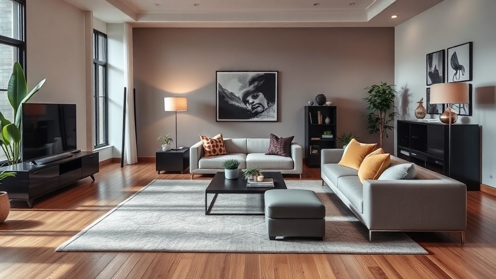
That said, small rooms tempt this approach. The logic seems sound—keep the center clear, maximize floor space. But the result is often a bowling-alley effect with too much distance between pieces. Pull the seating inward. Create a U-shape or L-shape that invites people to gather. A well-placed West Elm area rug can anchor the arrangement and define the zone without walls.
2. The postage-stamp rug
If the rug sits under the coffee table alone, it's too small. Full stop.
A living room rug should extend beneath at least the front legs of every major seating piece. Ideally, all four legs rest on it. This isn't about luxury—it's about visual continuity. A tiny rug fractures the floor plane. It makes the room feel chopped up, which reads as smaller than it is.
The catch? Rugs are expensive. A 5x8 costs significantly less than an 8x10 or 9x12. But skimping here undermines everything else. For a standard three-seat sofa and two accent chairs, an 8x10 is the practical minimum. In open-plan spaces, go bigger. The rug should unify the seating area as one distinct territory.
How do you arrange furniture in a small living room?
Start with the largest piece—the sofa—and place it to maximize both function and flow. Then build outward, leaving 18 inches of walkway between pieces and avoiding any layout that forces people to cut through the main conversation zone.
3. Ignoring the traffic plan
Every room has highways. People enter. People exit. They head to the kitchen or the loo. When furniture blocks those natural paths, the room feels obstructed.
Worth noting: traffic flow isn't just about convenience. It's about perception. A clear path around the perimeter (or through a designated corridor) makes the room feel larger. When guests have to weave between the sofa and the media console, the space feels cluttered—regardless of how minimal the decor might be.
Before buying anything, map the room. Draw lines from door to door. Identify where people will walk. Then place furniture to protect those routes. The IKEA room planner is a free tool that lets you test layouts before lugging a Karlstad sofa up three flights of stairs.
4. Hanging art at gallery height in a domestic space
Art hung too high severs the room. It draws the eye upward and away from the human activity below, creating vertical distance that feels hollow rather than spacious.
The rule—broken daily—is simple: center pieces at eye level, roughly 57 to 60 inches from the floor. In rooms with low ceilings (anything under 8 feet), this matters even more. High art emphasizes the ceiling. That's not what you want in a cramped space.
Gallery walls can work, but they need discipline. Keep frames cohesive. Leave breathing room between pieces—two to three inches is plenty. And never let art climb above door height. It starts to feel like the walls are closing in from above.
What size rug should I put in my living room?
The rug should be large enough that all front legs of the sofa and chairs rest on it, with at least 6 inches of rug extending beyond each piece. In most standard living rooms, that means an 8x10 foot rug minimum.
| Room dimensions | Recommended rug size | Typical furniture arrangement |
|---|---|---|
| Up to 10 x 12 ft | 5 x 8 ft | Small loveseat + one chair (front legs on) |
| 11 x 13 ft to 13 x 16 ft | 8 x 10 ft | Three-seat sofa + two chairs (front legs on) |
| 14 x 17 ft or larger | 9 x 12 ft | Full sofa + two chairs + chaise (all legs on) |
| Open-plan living | 10 x 14 ft or custom | Multiple seating zones unified by one rug |
Use this as a starting point, not gospel. A 9x12 in a 12x14 room can feel generous in the best way. A 5x8 in the same space looks like a bath mat that got lost.
5. Falling in love with scale—in the wrong room
The deepest sectional at Restoration Hardware. The oversize leather club chair. The marble coffee table that weighs as much as a small car. Beautiful pieces. Wrong proportions.
Scale is relative. A 96-inch sofa can dominate a compact room or disappear in a loft. The mistake is buying based on the showroom floor—where ceilings are 14 feet and walls are fifty feet away—then wedging the same piece into a terraced house in Hackney.
Here's the fix: measure twice. Use painter's tape to map out the footprint of any prospective piece on the floor. Live with the outline for a day. Walk around it. Open windows. Pour a drink. If the tape feels intrusive, the real thing will feel worse.
For smaller spaces, consider alternatives with lighter visual weight. A mid-century piece with tapered legs (like the Article Sven sofa) occupies the same seating area as a bulky Chesterfield but leaves room underneath for the eye to travel. Glass or acrylic coffee tables perform the same trick. They provide surface area without the mass.
"A room should never allow the eye to settle in one place. It should smile at you and create fantasy." — Juan Montoya
Montoya wasn't talking about minimalism or maximalism. He was talking about movement. Cramped rooms stop the eye. They create bottlenecks—visual and physical. The goal isn't emptiness; it's flow.
Lighting plays a role too. A single overhead fixture pools light in the center and leaves corners to die. Layer your lighting: ambient (ceiling), task (reading lamps), and accent (wall sconces or picture lights). Uplighting in corners stretches the walls upward. Table lamps at eye level when seated warm the conversation zone without flattening it.
Storage is another stealth culprit. Open shelving looks airy—until it's crammed with books, candles, and souvenirs from every holiday since 2012. Closed storage (cabinets, ottomans with lids, media consoles with doors) hides the visual noise. If you love open shelving, edit ruthlessly. Leave 30 percent of each shelf empty. Negative space isn't wasted space. It's what makes the objects you keep matter.
Color and pattern follow the same rules. Dark walls don't automatically shrink a room—contrary to the myth—but heavy, large-scale patterns on every surface will. If you want bold wallpaper, commit to one feature wall. If you love a moody charcoal paint (Farrow & Ball's Down Pipe is a classic), balance it with lighter upholstery and reflective surfaces.
Windows deserve mention. Heavy drapes that pool on the floor can feel luxurious in a grand sitting room. In a smaller space, they eat real estate. Mount curtain rods close to the ceiling and extend them 10 to 12 inches beyond the window frame. This tricks the eye into seeing larger windows. Choose lightweight linens or cotton rather than brocade or velvet. Let the light in.
Finally, resist the urge to fill every gap. A corner doesn't need a plant stand just because it's empty. A wall doesn't need art just because it's bare. Editing is a design skill. The best rooms—large or small—leave room for life to happen. A place for a guest to set down a drink. Space to stretch out legs. Sightlines that travel from one end of the room to the other without obstacle.
Fixing a cramped living room rarely requires a bigger budget. It requires better decisions. Measure the rug. Float the sofa. Protect the paths. Hang the art lower. And buy for the room you actually have—not the one you saw in a magazine spread shot with a wide-angle lens in a Chelsea loft.